Big Ugly House Tour - Part 2: Hallways and Stairways
We're back with the house tour today. Since Kelly's Korner is focusing on front halls and entry ways, I thought I would as well. Be prepared, this is picture heavy and while we start out in loveliness, you'll also get to see a small reason we refer to our home as, "The Big Ugly House."
So, come on in. This is from the vestibule between the exterior front door and the interior front door. The interior door has a tendency to slam, and I just know that someday the glass will shatter.
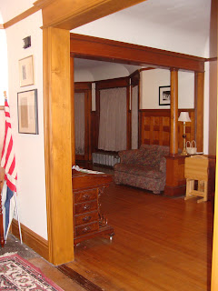
We'll now move around the front hall clockwise. The opening to your right which leads into the living rooms:
The doorway straight ahead which leads into the dining room. That panelled wall on the left? It is actually a doorway which leads down a half flight of stairs to the exterior servants' door. It's blocked-up, but you can see it from the inside. When we bought the house, the previous owners had turned it into a full bath. It was ugly, ugly, ugly and now it is a stairway to the basement and we use the landing for coat and game storage.
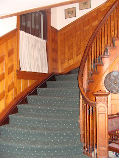
The stairs going up. Yes, those are car seats hiding behind the pretty chair. We moved the girls into forward facing seats and their infant seats are currently living here in the front hall. I don't really notice them anymore... it seems they have become a part of the scenery.
One of the many fireplaces in the house. Some work and some don't. This one doesn't. Oh, and that's a gong hanging on the front of the fireplace. I use it sometimes to call all the children to me quickly because they can hear it when they are upstairs on the third floor. Think Cheaper by the Dozen
Having seen the whole front hall, let's head up the stairs.
The second floor landing. That's the little boys' room that you see straight ahead and the banister to the stairs to the third floor.
This is the second floor hallway. The wallpaper is not attractive and if you look closely you can see the dark stripe our dog rubbed on it. The wallpaper is textured and she liked the way it felt to rub up against it. The wallpaper is covering plywood panelling which was put up over crumbling plaster. The fix is a bit more complicated than stripping wallpaper and painting. So the ugly wallpaper stays up.
So now we'll head up to the third floor.
I realize it looks okay from these pictures. Through the glass door is the third floor playroom. There are two of the doors, but there was an, um, accident with the other one and a couple of panes of glass are missing.
This is the ceiling of the third floor landing. See the pretty window? How you can't see the top of it because the ugly dropped acoustic tile ceiling is below the window? Oh, and be sure not the miss the space pack air conditioning tube hanging down. Because the ceiling is horrible and needs to come out, we didn't have the HVAC guys finish the vent opening. I rarely spend much time looking at this window which could explain the cobwebs I am now noticing.
The is the top of the third floor. The playroom is to the left and straight ahead is the door to what my children not-so-lovingly call 'the stinky room'. It is three rooms which are in complete disrepair and need to be taken down to the studs and redone to make them usable. The house was a rooming house before we bought it and this was one of the apartments. The man who lived here had far too many incontinant cats, hence the name.
Let's leave the ugliness that I don't like to think about and go back to the nicer areas. This is the far end of the second floor hallway. It looks so nice and new because it is. It was part of the kitchen remodel we did two years ago. The door on the right is the schoolroom, then moving to the left are M.'s room, J.'s and my bathroom, and a linen closet.
And to end the tour, these are the back stairs, which are also new. The have a funny turn at the top, which is what you're looking at. My one regret about having redone this part of the house is that we had to get rid of the back stairs which split where you are looking. One half turned toward the left and went to the main part of the house, the other half turned right and went into the maid's quarters... a small bathroom connected to a small bedroom, which is now M.'s room. It was really unique and unusual, though in the end turned out to be completely unworkable in a modern house. Oh well. It's not as though the maid came with the maid's room.
Here are the rest of the back stairs, heading down into the kitchen. You can get a glimpse of the pen where the babies/toddlers spend a good chunk of time.
Thanks for joining me on this installment of the Big Ugly House tour.
______
Pictures are out of Much Ado About Nothing. None of them have A. in them alone, so you will have to go to this link to see them. A. is in the 11th picture from the top. Oh, you can see all the lovely costumes if you go to the show, too. Email me for details.
_____
One last late addition. Do you remember when I read and posted about the book, The Hole is Our Gospel


Comments
http://hanginloosewiththetuccis.blogspot.com/
Paula Adams